The Art of Movie Posters: Designing for Impact and Attraction
Movie posters serve as the first impression of a film. They blend color, typography, and imagery to create a visual narrative. Each design element plays a crucial role in establishing mood and attracting an audience. The balance of these components can transform a simple poster into a compelling invitation. What techniques do designers use to evoke curiosity and draw viewers into this world of cinema? The answers lie in the intricacies of their craft.
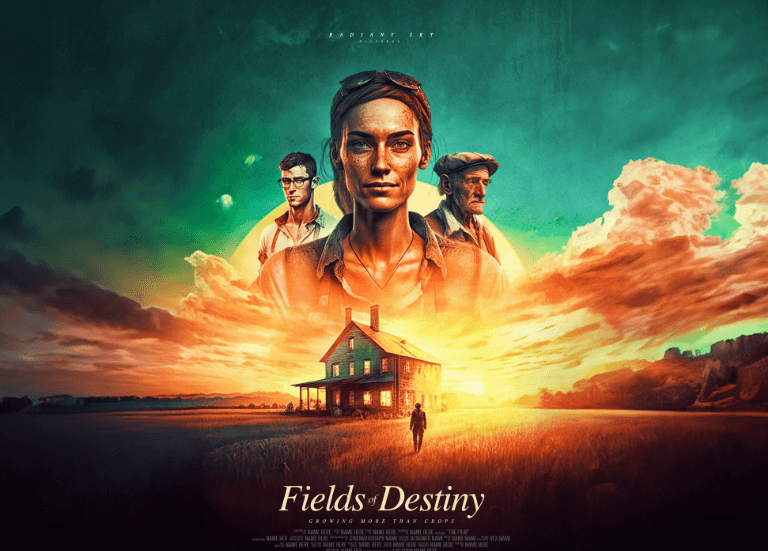
The Role of Color in Movie Poster Design
As the first impression of a film, the color scheme of a movie poster wields significant influence over audience perception.
Bold reds ignite passion, while tranquil blues evoke calm. Each hue carries color symbolism, stirring emotional responses that draw viewers in.
Typography: The Power of Fonts in Visual Storytelling
While colors evoke emotions, typography brings a unique character and voice to movie posters, shaping how narratives are perceived.
Thoughtful font selection establishes a creative hierarchy, guiding viewers’ eyes and enhancing thematic resonance. Bold typefaces may signal action, while elegant scripts suggest romance.
Each letter becomes a brushstroke, painting a vivid picture that entices audiences and invites them into the cinematic experience.
See also: How Soundtracks Shape the Emotional Experience in Movies
Imagery and Composition: Capturing the Essence of the Film
Imagery and composition serve as the visual heartbeat of a movie poster, encapsulating the film’s essence in a single frame. Through effective visual symbolism, designers evoke emotions, drawing viewers into the narrative.
Composition techniques, such as balancing elements and utilizing negative space, guide the eye, creating an engaging focal point. This harmony transforms static images into dynamic invitations, sparking curiosity and igniting imagination.
The Psychology Behind Effective Movie Posters
Understanding the psychology behind effective movie posters reveals how subtle cues can influence viewer perceptions and emotions.
Color palettes evoke feelings, while striking visuals capture attention. Typography can suggest genre and tone, shaping audience perception before viewing.
Conclusion
In the enchanting realm of movie poster design, every hue, font, and image dances together to whisper the film’s story before the first frame is even shown. This art form, a visual serenade, invites audiences to embark on a journey, sparking intrigue and anticipation. As we peel back the layers of creativity, it becomes clear that a masterfully crafted poster is not merely a marketing tool, but rather a charming portal into cinematic dreams waiting to unfold.